In this guide, you’ll learn:
What is a logo?
A logo is a symbol, image, type or combination that identifies a brand. Logos are utilised to convey ownership of a company, product or service. A logo is also core part of your brand identity design.
A good brand logo design should also be memorable and strive to tell the brand’s story. This is important to help create an emotional connection with the target audience.
From a technical perspective, the logo design should work well in all branding environments and be scalable to large and small sizes.

Do I need a logo for my brand?
In most cases, yes. There are some exceptions where a startup business can succeed initially without one. But, as a rule, a well-designed logo is essential for growing the brand and retaining loyal customers.
So it makes sense to prioritise a logo design when setting up your business to gain those benefits from the start. Essentially you need a logo if:
- You intend to use stationery, like business cards and letterheads
- You want to look professional (Who doesn’t!)
- You want to differentiate your brand from competitors
- You want to gain and retain customer recognition
- You want to advertise your brand visually
- You want to grow your brand in the future, adding new products or services
What are the elements of a logo design?
A logo can contain a logomark (the symbol or icon) used on its own or in conjunction with a logotype (text design) to create the logo. Most logos utilise these two elements to create the core brand logo.
However, brand recognition can be so good over time that the logomark or logotype in isolation is strong enough to identify the brand.
Another element of logo design is colour, and this, along with font styles, can be used to create brand style guidelines.


Should my logo have a tagline?
In most scenarios, your logo may not accommodate a tagline, but in some cases, it can work.
For example, on-screen branding usually has limitations on size and shape. Because of this, the tagline might be illegible in some scenarios and detract from your brand. Despite this, incorporating a slogan may work when you want to feature your logo as a hero element.
When there is such a requirement, I like to create a logo variant, or a lock-up, that includes a tagline if one exists for the brand. For a more robust solution, we can utilise responsive logo design.

What is responsive logo design?
You may have heard of the term “responsive web design”. It refers to the ability of a website design to adapt to the constraints of the device used to consume the content. This advancement in website design was born through the increasing dominance of mobile device usage.
In simple terms, responsive web design works by automatically adjusting the website design based on the device width. This ensures that the size of elements and layout works no matter how the user decides to view the website.
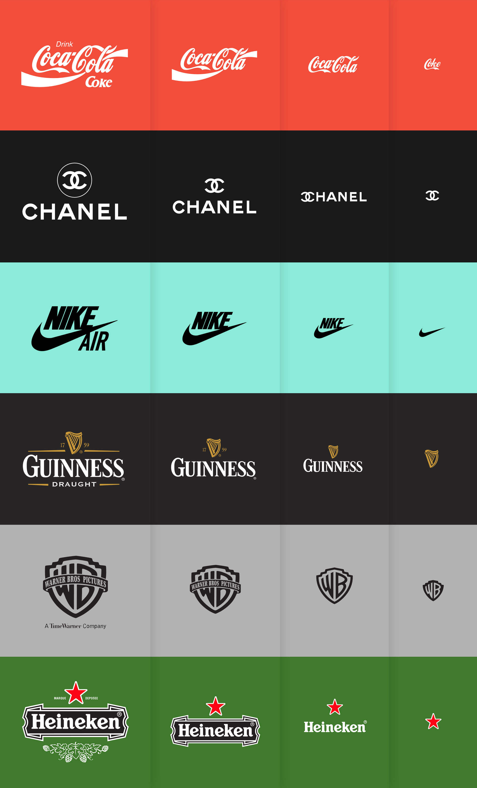
This design method led to the popularity of responsive logos, where the logo design is adjusted to suit the space available. As a result, a logo can retain more detail on larger screens and adapt as the screen space decreases - the best of both worlds.

What are the 7 key steps when creating a brand logo?
- Read and understand the design brief and discuss the brand in detail with the owner to reveal the brand story and expected use cases.
- Sketch ideas while researching competitors and industry standards. For me, this is the essential part of the creative process, allowing for the quick generation of original concepts.
- Create digital versions of the concepts you want to present to the customer, using a variety of symbols, fonts and colours.
- Present the concepts and gather feedback on client preferences for the overall design, colour and styles.
- Complete the final logo based on the client preferences and create the required logo variations. Typical logo variations might include a tagline, reverse colour, print and screen, or web icons (like favicons and social profiles).
- Test the logo variants for technical robustness and create a final proof for review and sign-off.
- Create final logo artworks in the required formats and deliver them to the client with instructions for proper usage.
What’s in a logo artwork package?
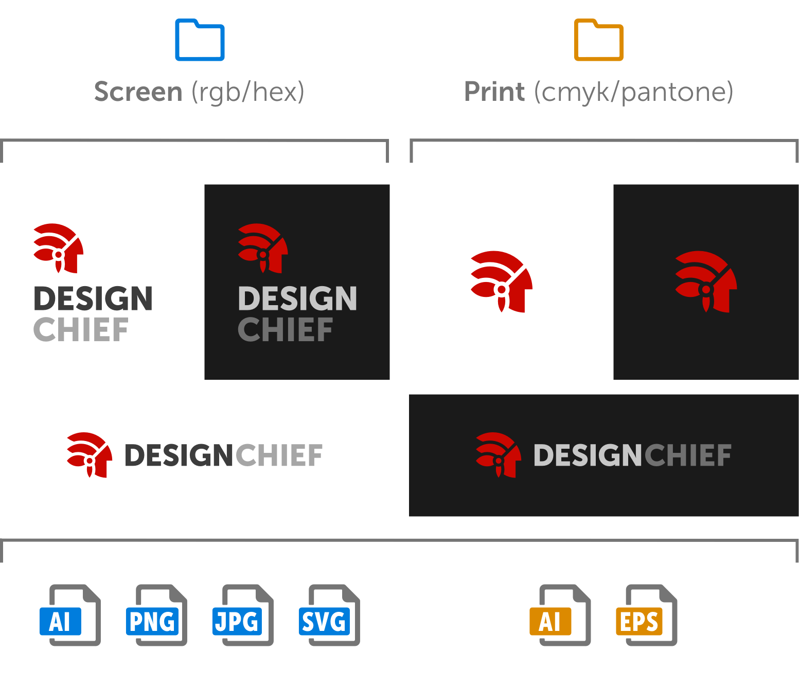
Your brand logo package should contain all logo variations created for print and screen use. In addition, some usage instructions should also be provided, such as the priority of logo variant, colour specifications etc. I like to create a folder structure with the usage intent (screen or print) top in the hierarchy, followed by the logo structure variants like the example below.

